New data show the most emissions-intensive sectors in Canada across Scope 1, 2, and 3 emissions.
At 440 Megatonnes, we’ve been tracking Canada’s climate progress through our Canadian Emissions Intensity Database, which helps businesses, governments and households estimate their emissions footprint.
Since we launched in November 2022, new data have become available.
The database provides emissions intensities for all the scope emissions in more than 60 economic sectors and 51 final demand expenditure categories and exports. This includes emissions from direct combustion (Scope 1), purchases of electricity and heat (Scope 2), and across supply chains (Scope 3 upstream).
Newly available data includes the federal government’s official National Inventory Report for 2021 greenhouse gas emissions. In addition, we’ve updated economic data points based on GDP from Statistics Canada for that year.
With new data in hand, we can compare progress across sectors and categories. And we can provide a more up-to-date tool for those using the database.
Canada’s top emissions-intensive sectors
Here we’ve broken down the top five most emissions intensive sectors in 2021 and how they compare to the previous year’s data.
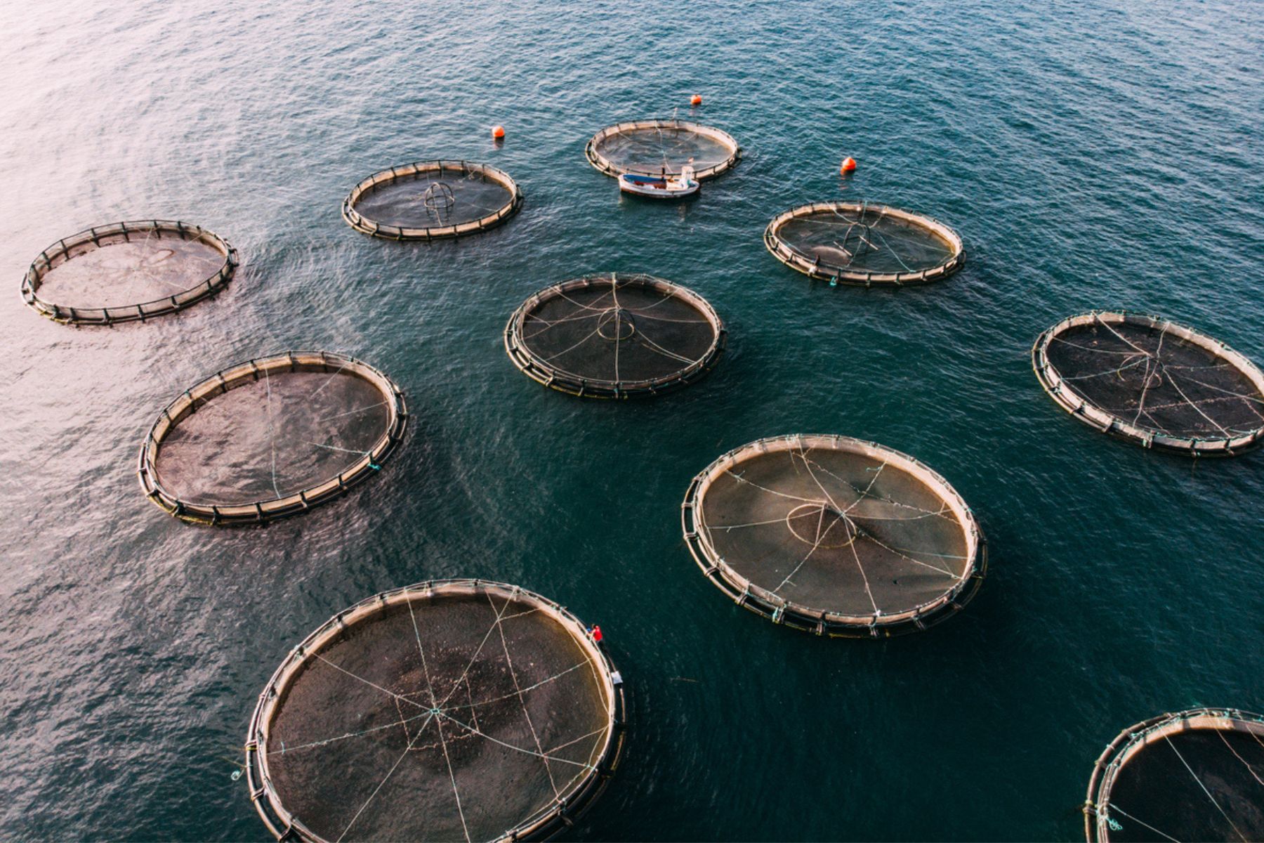
In 2021, animal production and aquaculture was the most emissions intensive sector, followed by water, sewage and other systems, iron and steel mills and ferro-alloy manufacturing, and so forth.
In most cases, emissions for each sector were dominated by Scope 1 emissions—with the obvious exception being the petroleum and coal manufacturing sector. Some sectors saw greater year-on-year declines in emissions intensity, including petroleum and coal manufacturing, animal production and aquaculture, and iron and steel mills and ferro-alloy manufacturing.
Caveats to consider about emissions intensity
A couple points are worth mentioning before diving further into the data.
First, we’re considering the emissions intensities of each sector, which is different from total emissions. The data shows which sectors, pound for pound, emit the most greenhouse gases per unit of economic value, as expressed by GDP output.
This can be useful, not only to estimate an organization’s Scope 3 emissions footprint, if it isn't otherwise calculated from supply chain data. But it’s also useful to get a sense of the potential trade-offs when reducing emissions in different sectors through policy. Those sectors with high emissions intensity generate the smallest amount of economic wealth (GDP) per tonne of carbon emissions, and vice versa.
The second point is that our denominator—GDP, in this case—can change year to year based on whether commodity prices or profit margins change. That means a change in emissions intensity expressed in this way may not reflect an actual improvement in greenhouse gases emitted per unit of physical production—of tonnes of steel or barrels of oil, for example.
Physical units for emissions intensity are always a better measure to understand a sector’s progress to decarbonization, but this data can be difficult to come by. That said, tracking emissions by GDP is still a useful way to estimate emissions intensity and can provide a single metric against which all economic sectors can be compared against.
A deeper dive into the data
With that in mind, consider the steep declines in emissions intensity for petroleum and coal manufacturing in 2021, at nearly 25 per cent.
At first glance that seems like a good news story for climate progress. However, the bulk of that drop was driven by a decline in GDP that year (-32 per cent), and only modest declines in total emissions (-2 per cent).
Similarly, animal production and aquaculture saw a 15 per cent decline in emissions intensity, driven largely by a drop in GDP (-18 per cent), not a change in emissions.
It's also useful to consider the scale of these sectors relative to one another. Figure 2 shows the size of each sector in terms of GDP on the x-axis and the size of total Scope 1, 2 and 3 emissions on the y-axis. The total emission intensities are indicated by the bubble sizes.
You can see the rank order of each sector changes when considering total emissions and GDP contributions. Petroleum and coal manufacturing are far ahead of the pack on both metrics, but place fourth on emissions intensity. Likewise, water, sewage and other systems have the second highest emission intensity, but are the smallest of all sectors when it comes to total emissions and GDP. Animal production and aquaculture, the most emissions-intensive sector of the five, is still near the top when it comes to total greenhouse gas emissions and GDP contributions.
Decreasing emission intensity with clean tech
Each of these sectors have potential solutions to reduce emissions intensity in line with a net zero world.
Wastewater treatment plants can capture biogas and repurpose it to replace fossil fuels. The cement sector is piloting a number of ways to cut emissions, including through new applications of carbon capture and storage (see here, here, here and here). Clinker substitution with renewable resources is another potential route. And government and the steel industry have made big investments in emissions-cutting technologies that will move away from coal-based blast furnaces.
Most of the emissions from animal production and aquaculture come from methane released through the digestive process of livestock and manure management. Substituting and adjusting livestock feed can reduce these emissions–for example, by moving from corn to barley, adding seaweed or other food additives, or switching to high-quality forages like alfalfa.
While the primary goal of the emissions intensity database is to help estimate emission footprints, it can also provide new perspectives on progress across all sectors of Canada’s economy on the road to net zero.
Seton Stiebert is an advisor to 440 Megatonnes and the Principal of Stiebert Consulting.